DebtPay Pro Redesign
DebtPay Pro is a CRM specifically for the Debt Settlement industry. The general goal for the redesign is to update the overall visual looking of the platform and make all the pages consistent. Since there are way too many functionalities, designing a new system for users to navigate is really mandatory.
The Problem
- The poor content management
- The current platform style is outdated
- Takes lots of time for users to find certain section
- Lack of consistency in different pages
- Not responsive
The Solution
- Design new nav system
- Update the style with the newest ui trends
- Remove the duplicated or useless steps between flows
- Create UI kits which apply across the whole platform
- Layout that is easy for client to read or edit
Design Direction
My approach for the redesigned the interface is to keep the simplicity and effectiveness of users' general experience and give users more options on how they want to view the data graphics. As an example, the customisable highlight feature can be used to avoid confusion for default settings on the auto highlights.
Color Choice
Since Debtpay Pro is an finance related SaaS application, the main direction for the color choice towards accuracy and readability.
Palette A
#1f1e24
#353541
#939598
#62b6e3
#c2deea
#ebf4f0
Palette B
#262F36
#535C6D
#f9f9f9
#254B81
#62b6e3
#051F42
Font Choice & Components
Components - Fontawesome

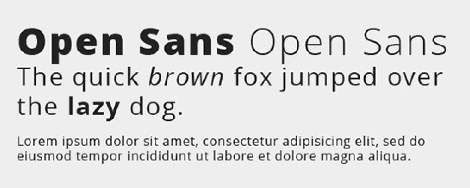
Text Font - Open Sans Regular
Redesign Of UI Elements
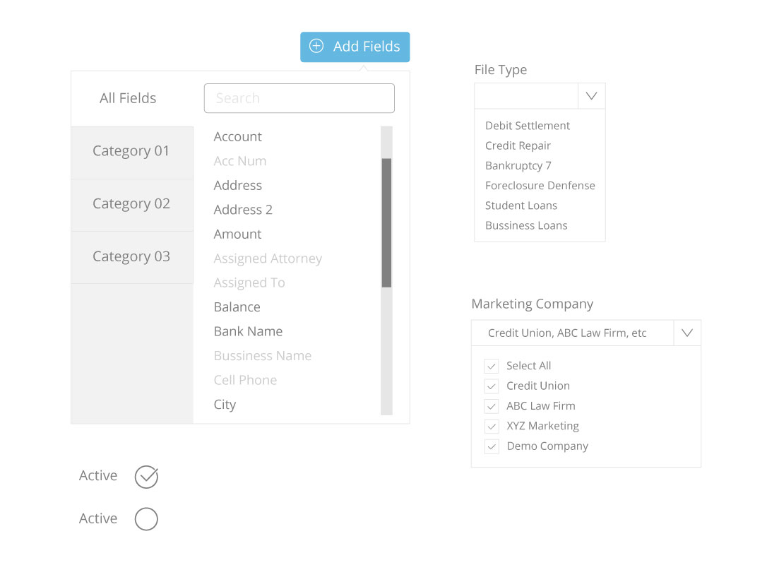
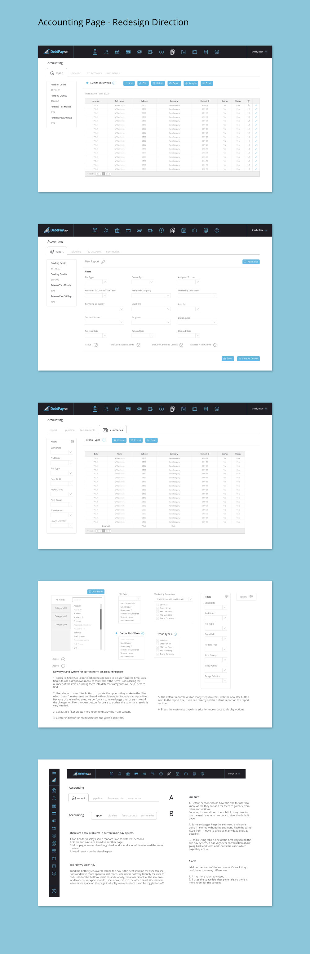
New style and system for current form on accounting page
1. Fields To Show On Report section has no need to be seen entired time. Solution is to use a dropdown menu to multi select the items. Considering the number of the items, dividing them into different categories will help users to find.
2. Users have to user filter button to update the options they make in the filter which doesn’t make sense combined with multi selector include trans type filter. Because of the loading time, we don’t want to reload page until users make all the changes on filters. A clear button for users to update the summary results is very needed.
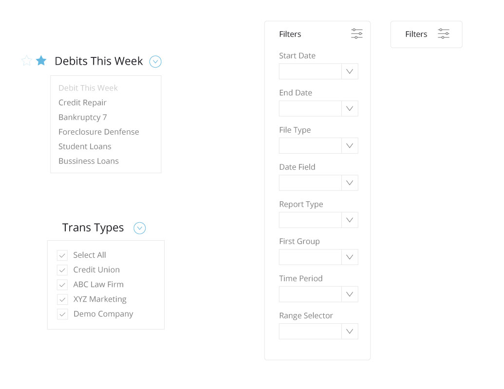
3. Collapsible filter create more room to display the main content
4. Clearer indicator for multi selectors and yes/no selectors.
5. The default report takes too many steps to reset, with the new star button next to the report title, users can directly set the default report on the report section.
6. Break the customize page into grids for more space to display options
Proof Of Concept