GOH1B
GoH1B is a U.S.-based immigration law firm specializing in H-1B visa services, particularly for international students and professionals.
My Role - Product Designer
My role focuses on creating a seamless, user-friendly experience that addresses the complex and often stressful immigration process.
- Understand the pain points of international students, recent grads, and professionals navigating the H-1B process.
- Prioritize accessibility and multilingual support (especially English and Mandarin, given GoH1B's market).
- Make legal info digestible (e.g., H-1B steps, timelines, success rates, FAQs).
- Help users find what they need quickly (clear menus, search, smart categorization).
- Work with developers to implement form logic, case tracking dashboards, and secure file uploads.
Brand Identity
Trustworthy & Authoritative
- Why it matters: Users are entrusting you with immigration status and legal documentation.
- Visuals: Clean, professional design. Use of seals, certifications (e.g., attorney bar numbers), and USCIS-aligned icons.
- Tone of Voice: Formal but friendly; clear, confident legal explanations.
Empathetic & Supportive
- Why it matters: Users are often stressed, confused, or scared about their immigration status.
- Visuals: Warm colors, friendly imagery, diverse representation of users.
- Tone of Voice: Reassuring, human-first. Example: “We’re here to guide you every step of the way.”
Clear & Transparent
- Why it matters: Users dislike legal ambiguity. They want to know what they’re paying for and what their chances are.
- Visuals: Use of infographics, timelines, calculators, visual guides.
- Tone of Voice: Straightforward. Example: “No hidden fees. Full refund if not selected in lottery.”
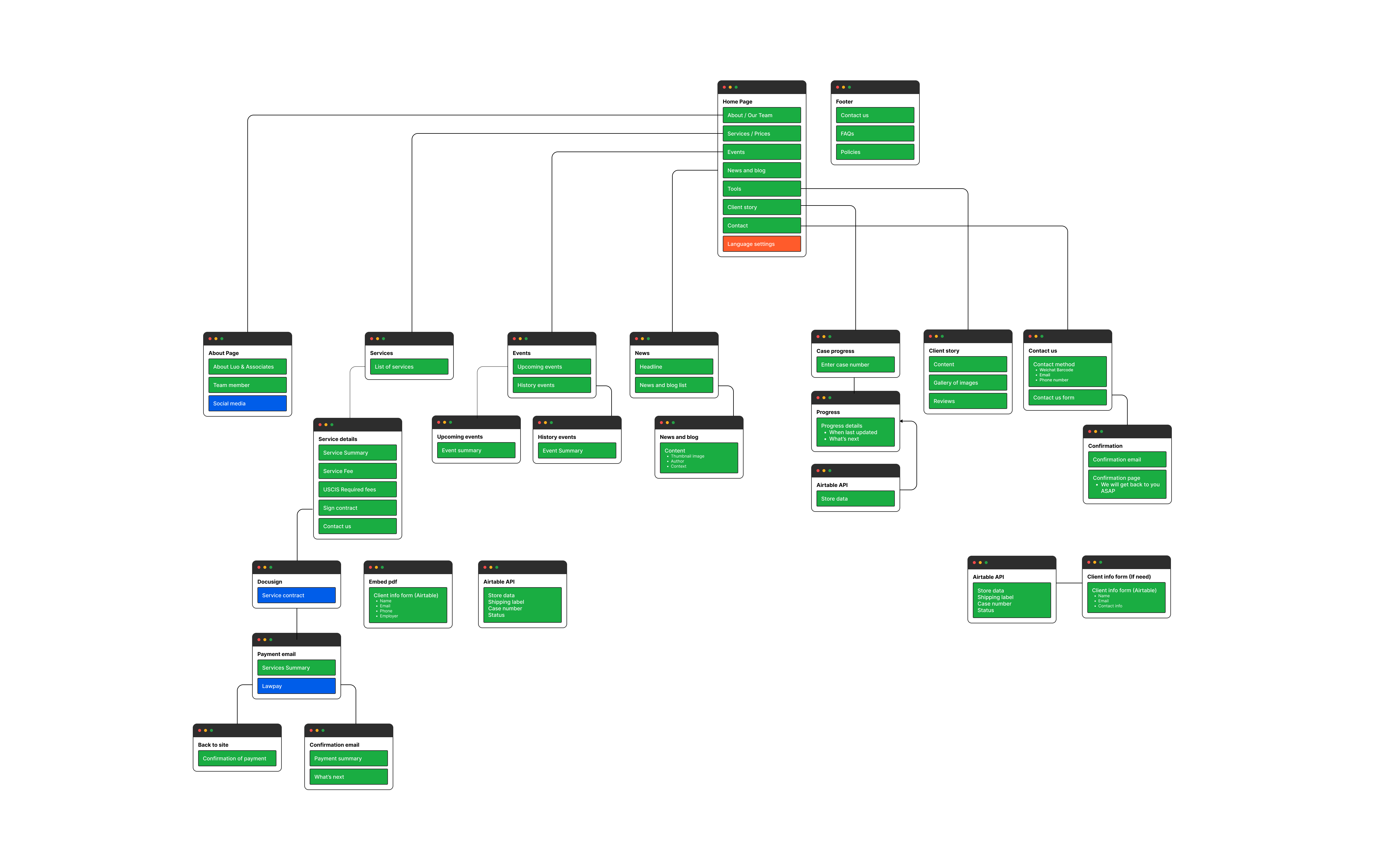
Site Map and Navigation
Creating a site map and navigation design for an H-1B visa services website involves balancing clarity, efficiency, and trust-building.
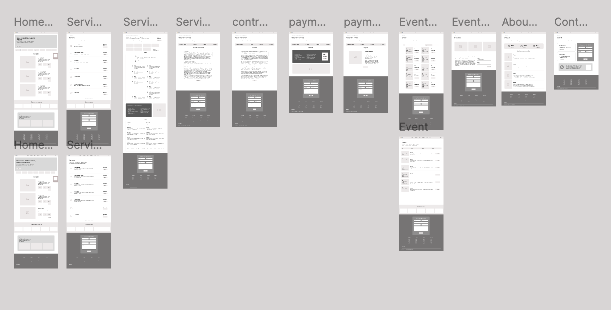
Wireframe & Low-fi Mockups
In this early design phase, I focused on defining the core layout, structure, and user flow without the distraction of color, imagery, or branding. The goal was to validate information hierarchy, navigation logic, and task completion paths
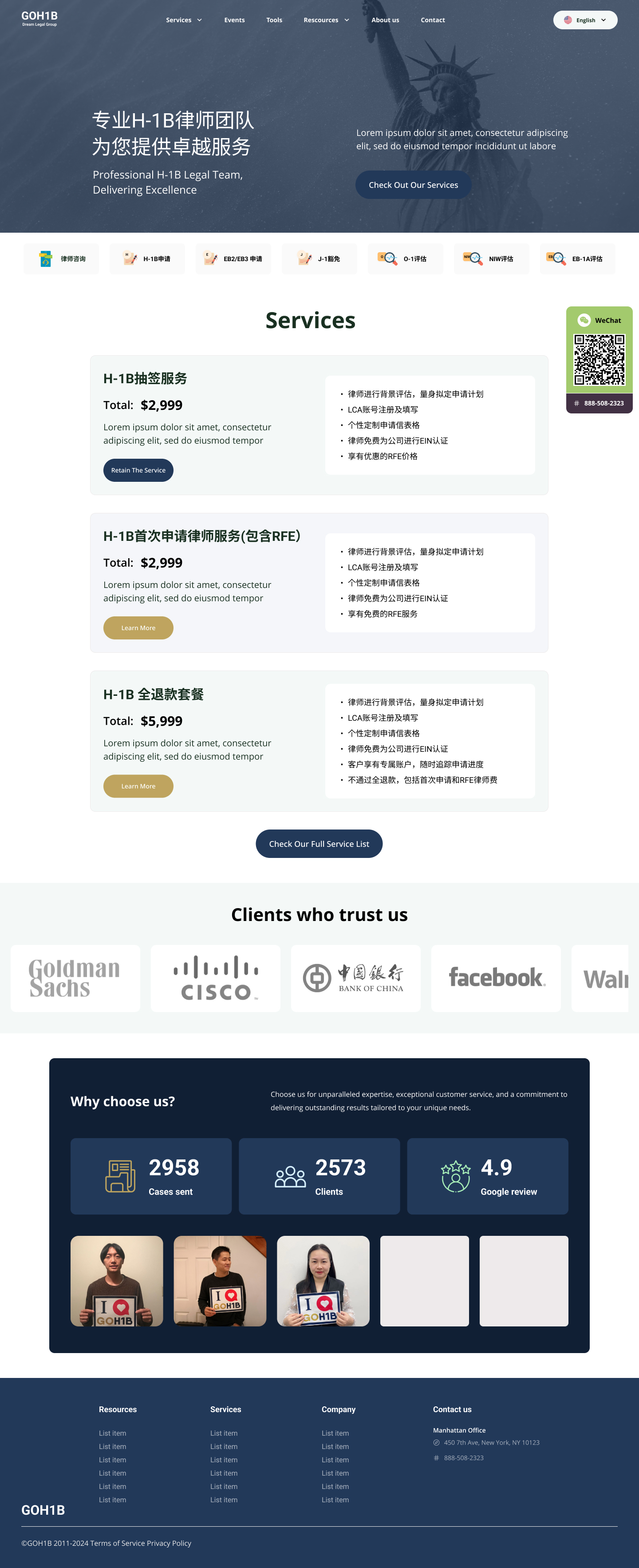
Visual Design Iteration
Visual design iteration is the process of progressively refining the look and feel of a product through multiple design versions based on user feedback, usability testing, and business goals.
1. For the first design draft, I want to establish a look that reflects trust, clarity, and support.
2. For the second iteration, improve flow, readability, and emotional tone.
3. Final iteration
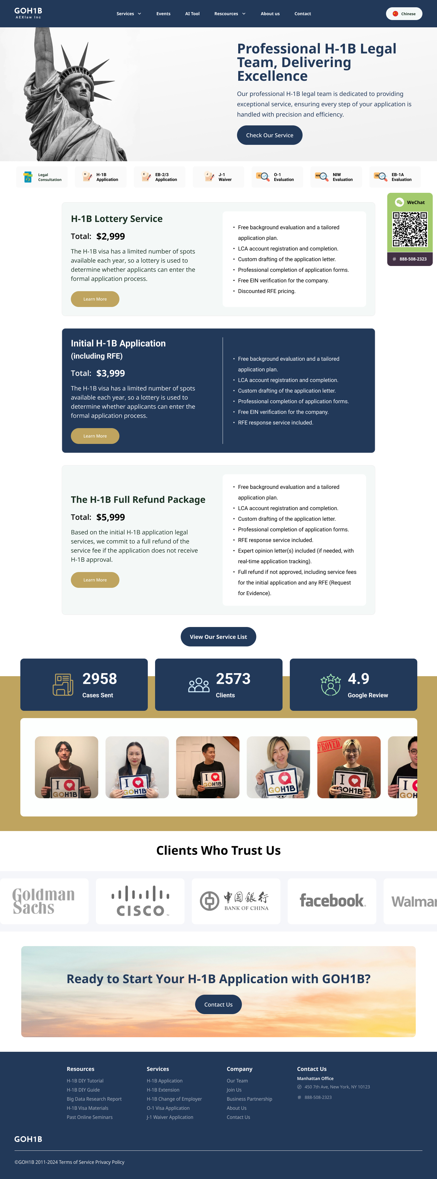
- Swapped gray legal text for darker, readable font
- Introduced success metric cards (“98% approval rate”)
- Redesigned case dashboard with visual progress bars and alerts
- Added diverse illustrations and attorney profiles to humanize the experience
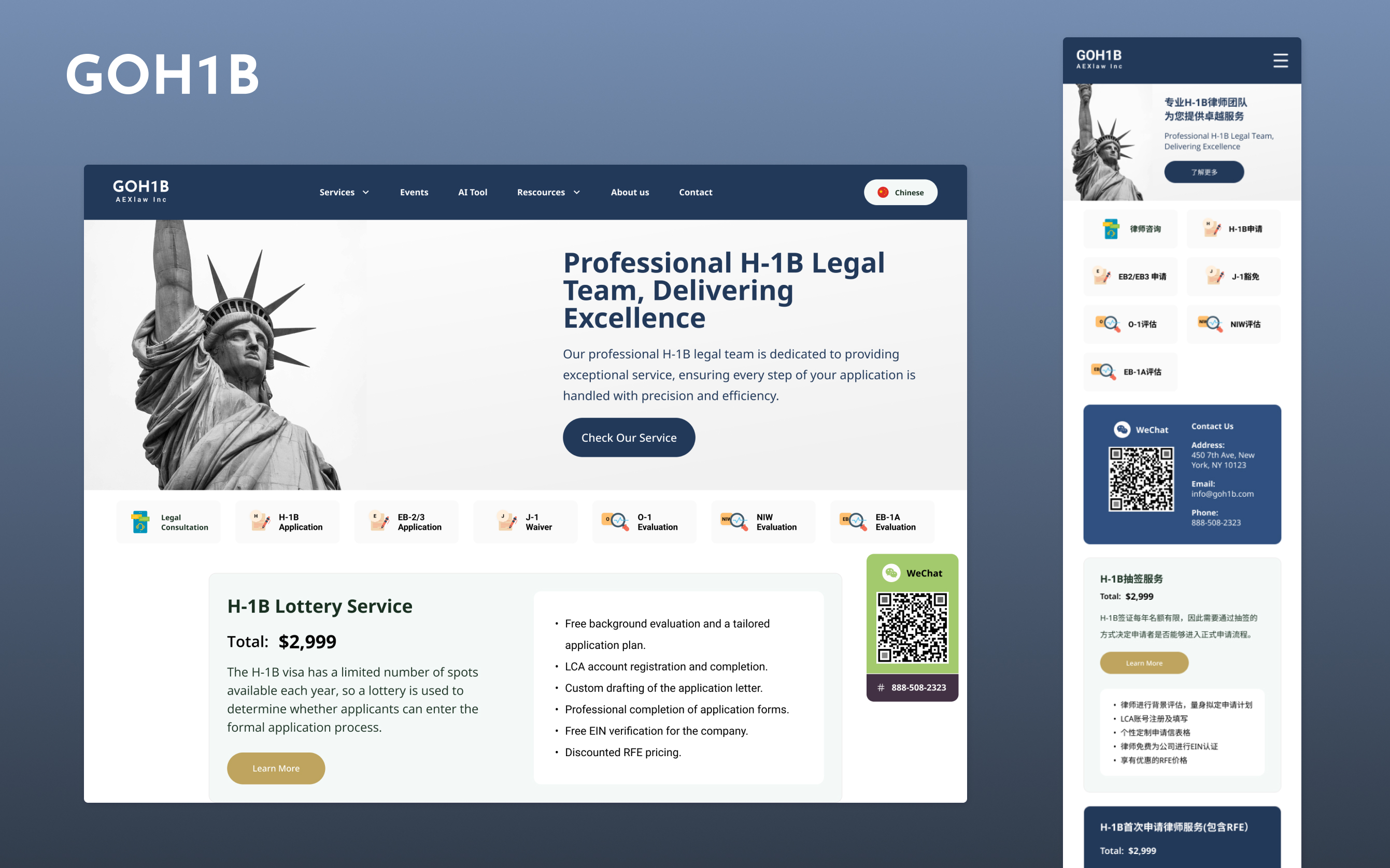
Screens design
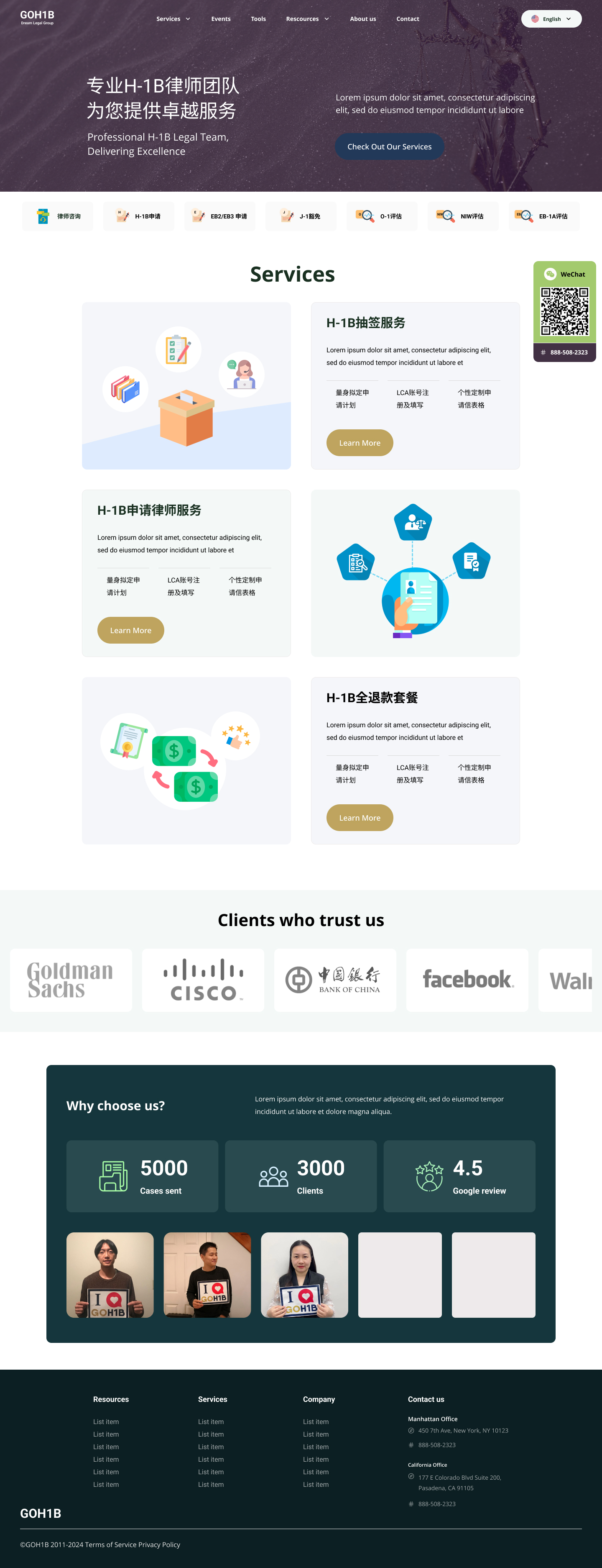
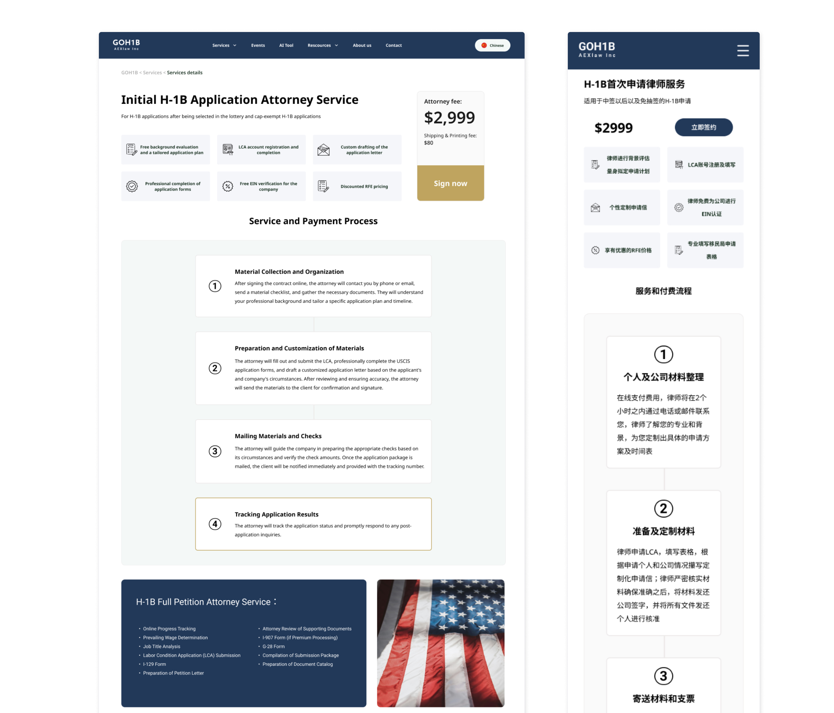
Once the wireframes were validated, I moved into high-fidelity screen design, applying the brand’s visual identity to bring clarity, trust, and warmth to an otherwise complex legal experience. Each screen was designed to guide users with confidence and ease, whether they were first-time applicants or handling an H-1B transfer.
Services details screen: Step-by-step guidance with pricing transparency and legal disclaimers
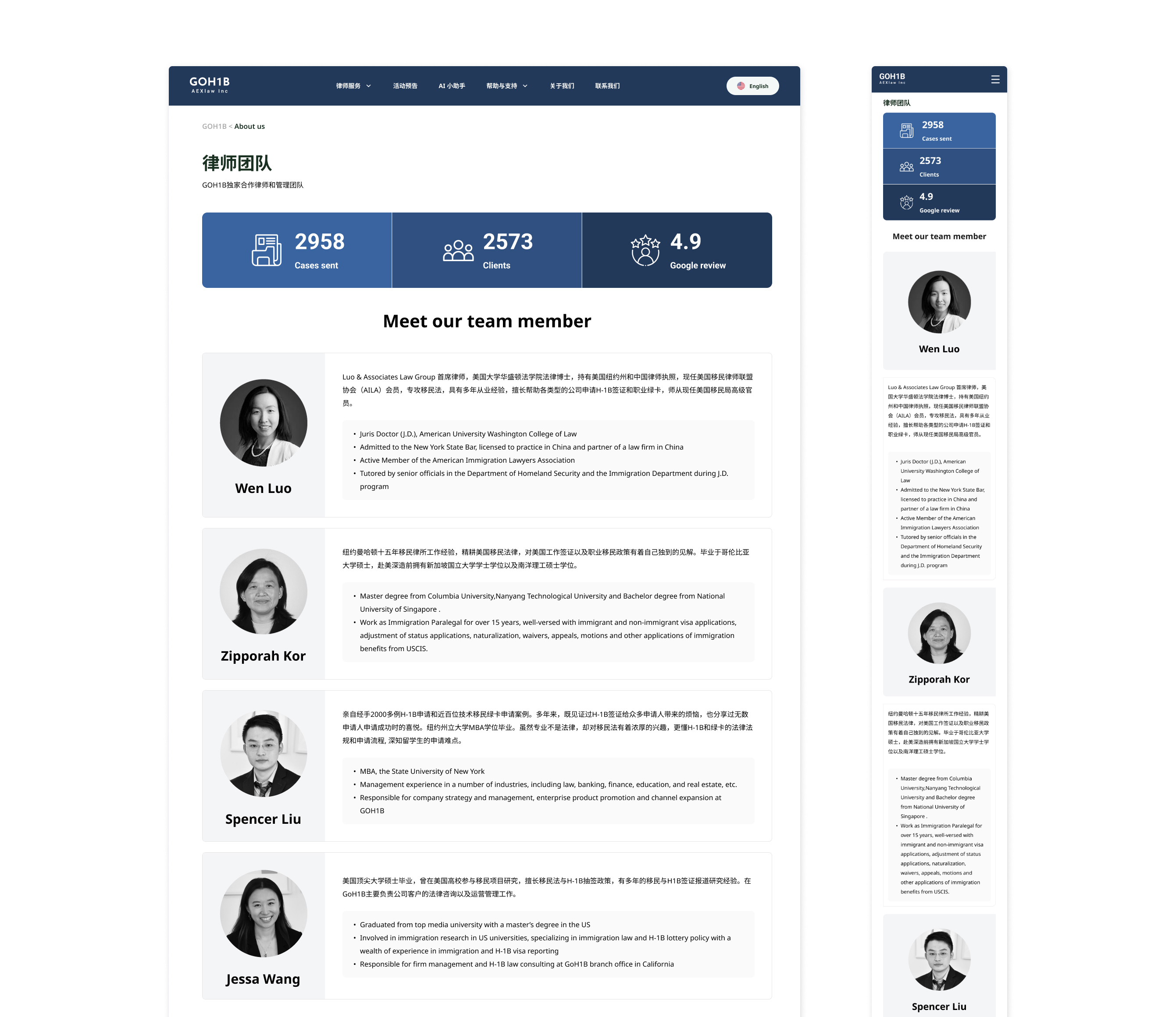
About us screen: Integrated attorney verification badges and trust metrics to reinforce legitimacy
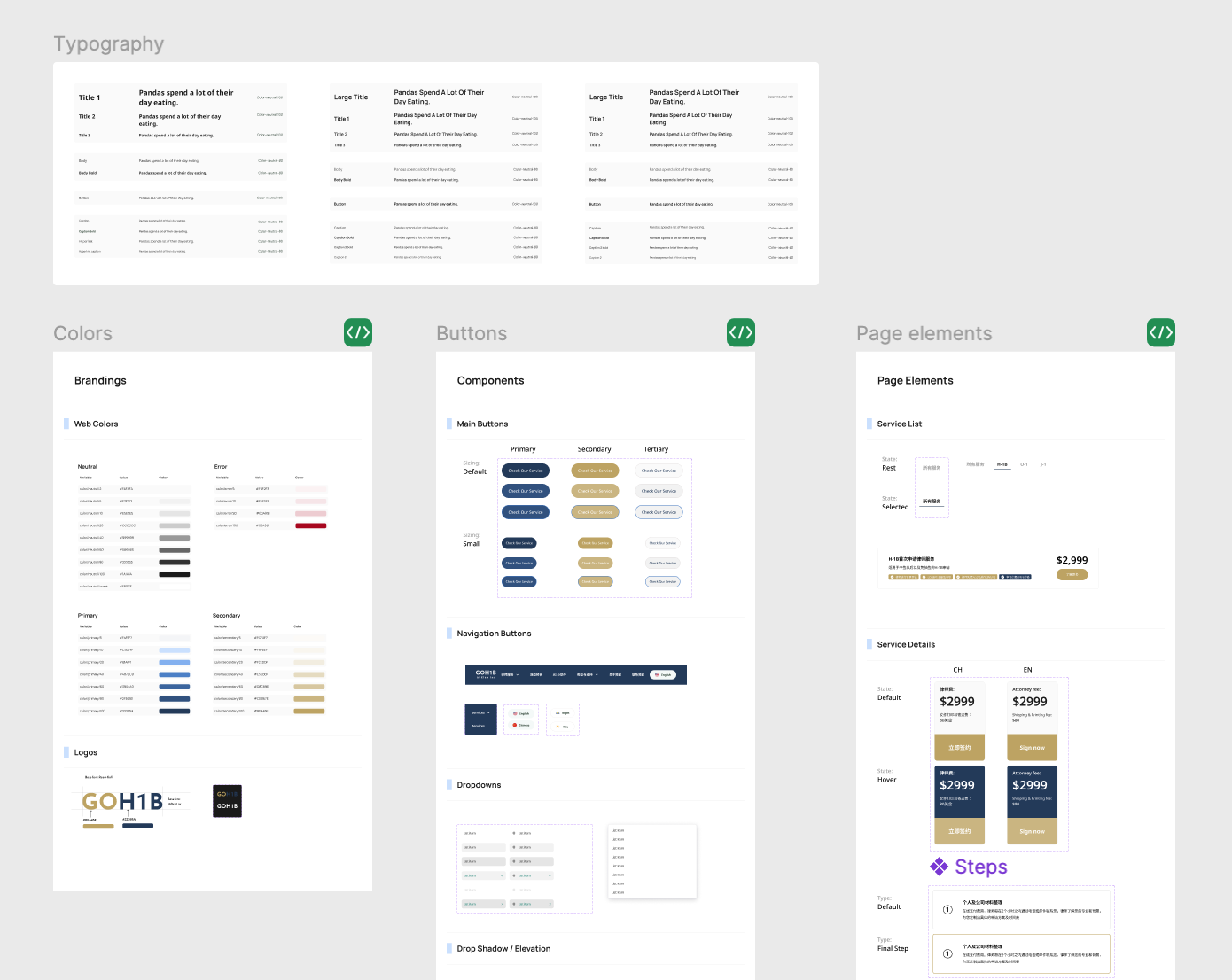
Design System
To ensure consistency, scalability, and collaboration across design and development, I built a comprehensive design system that serves as the single source of truth for the product’s visual and interaction patterns.